Provence style interior: how to pull it off in a city apartment without the clutter
Provence style interior for apartments: palette, materials, how it differs from country and shabby chic, clutter mistakes, and a try-on on your room photo.
Provence style is the light rural style of southern France: whitewashed walls, pale wood with a worn finish, linen and cotton, soft pastel accents and simple furniture. It works in a city apartment if you take its palette, its materials and 2–3 signature details and don't try to build a farmhouse. The smaller the apartment, the stricter you need to be with decor.
People search for Provence a lot, and the usual answer is a gallery of pretty country houses. This article is about something else: moving the style into an ordinary apartment with a 2.5 m ceiling, plastic windows and radiators under them.
What is Provence style in interior design?
Provence is the farmhouse interior of the French south, where everything looks like it has lived in the house for decades. The paint on the dresser is slightly worn, the linen at the window has faded in the sun, and there is pottery and a bunch of dried lavender on the table. There is no luxury or shine. There is warmth, light and natural materials.
You can recognize Provence by three signs at once:
- A light, whitewashed base. Walls the color of baked milk, a whitewashed ceiling, a light floor.
- Furniture with a past. Paneled doors, curved legs, patina and soft wear.
- Accents from nature. Lavender, olive green, faded blue, terracotta.
One sign on its own doesn't make a room Provence. Scandinavian style also has white walls, and shabby chic also has worn furniture.
Signs of Provence: palette, materials and furniture
Provence is built from specific materials, so the easiest way to check it is with a table. The left column is what makes the style, the right column is what pulls a room away from it. Treat it as a guide, not a list of bans: one glossy detail won't cancel the style, but three or four at once will show.
| Element | What works in Provence | What breaks the style |
|---|---|---|
| Walls | white with a warm undertone, cream, textured plaster, painted wood paneling | glossy paint, bright wallpaper, cold gray |
| Floor | light oak or ash, distressed boards, terracotta tile in the kitchen | dark glossy laminate, marble-look porcelain tile |
| Ceiling | matte white | glossy stretch ceiling, multi-level drywall with LED strips |
| Furniture | light wood, painted paneled fronts, patina, wrought iron details | plastic, high-gloss fronts, heavy dark furniture |
| Textiles | linen, cotton, small floral prints, gingham, thin stripes | shiny synthetics, velvet, large bright prints |
| Accents | lavender, olive, faded blue, terracotta | neon and acid colors |
| Lighting | wrought iron chandelier, fabric shades, warm light 2700–3000 K | cold white light, a grid of recessed spotlights across the ceiling |
A simple rule helps with the palette: one light base and no more than two accent colors per room. How to combine lavender, olive and blue so they don't fight, we covered in the article on color combinations in the interior.
How is Provence different from country, shabby chic and rustic?
These styles are often confused because they share a root: a rural home and natural materials. They differ in mood and in the amount of decor.
| Provence | Country | Shabby chic | Rustic | |
|---|---|---|---|---|
| Mood | sunny southern France | a farmhouse, usually American or English | vintage romance | raw nature, a hunting lodge |
| Palette | whitewashed base, pastel accents | warm earthy tones, red, brown | white, powder pink, cream | dark wood, stone, gray |
| Furniture | light, painted, paneled, with patina | heavy, wooden, plain | vintage with deliberate wear, curved shapes | rough solid wood, logs, raw timber |
| Textiles | linen, small florals, gingham | plaid, patchwork | lace, roses, ruffles | wool, fur, coarse linen |
| Decor | dried flowers, pottery, wrought iron, in moderation | lots of tableware on display | a lot: cherubs, candelabras, frames | minimal, large pieces |
Shabby chic is the closest to Provence in color. It is a 1980s style credited to designer Rachel Ashwell, and it relies on distressed vintage pieces (Wikipedia, in Russian). Provence is simpler. Wear in it is a trace of time and never becomes the main trick.
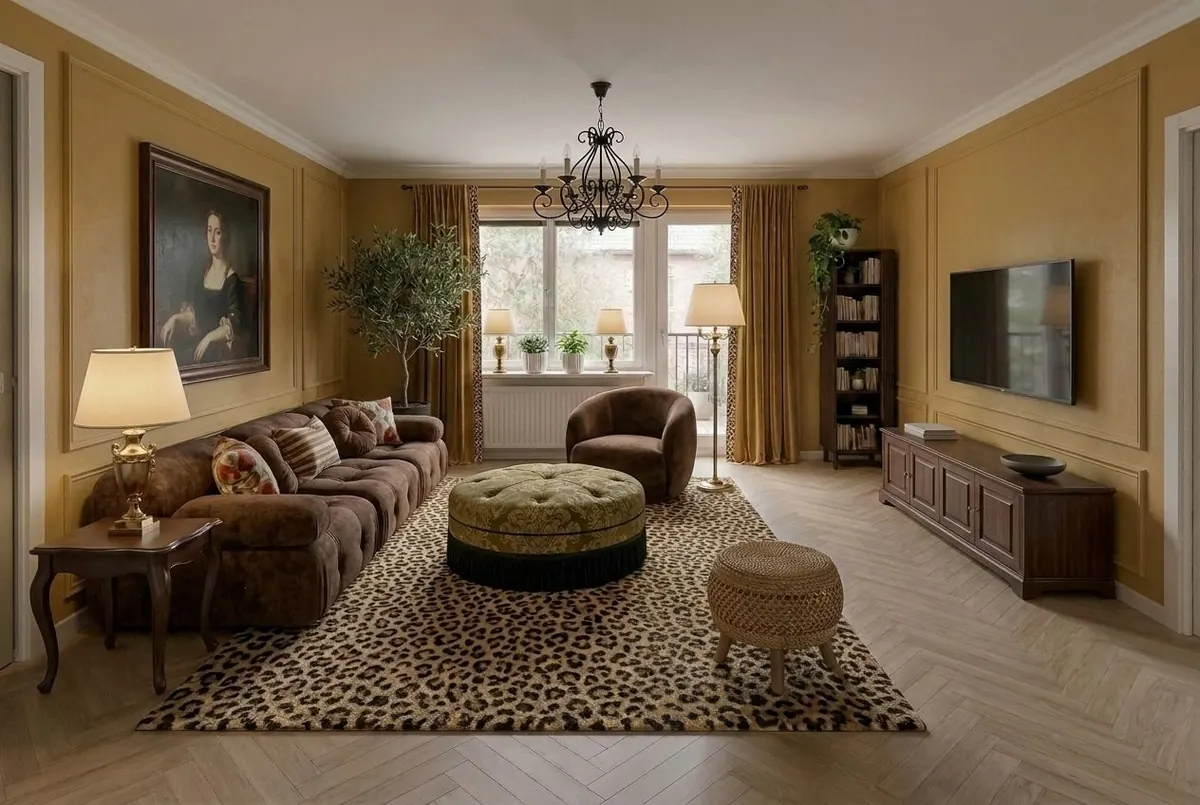
The photo above is not Provence, even though the room has a wrought iron chandelier and an olive tree. Ochre walls, dark furniture, a portrait in a heavy frame and a leopard rug take the interior toward a classic manor look; in Desow this style is called Manor. Provence in the same room would start with whitewashed walls and light furniture.
How do you do Provence in an ordinary apartment?
In a city apartment, Provence rests on finishes and furniture; the architecture hardly matters. There is usually no fireplace, no beams and no windows onto a garden, and there is no need to fake them at any cost.
Ceiling and beams
For new buildings, the Russian building code SP 54.13330.2022 requires living rooms to be at least 2.5 m high, or at least 2.7 m in several climate subzones (Kontur). The code covers the design of new and reconstructed buildings; older buildings have their own heights. Many apartments are built close to that minimum. Decorative polyurethane beams on such a ceiling eat up height, so in an apartment a matte white ceiling and a wrought iron chandelier are usually enough.
Windows and radiators
White plastic windows don't ruin Provence if you soften them with linen curtains on a simple rod or a Roman shade. A radiator under the window can be hidden behind a wooden cover painted the color of the wall. The cover needs a grille or slots and should be removable: that way the radiator still heats the room, and the valves and thermostat stay accessible.
Provence living room
The living room comes together around the sofa and the table. A simply shaped sofa with a light linen or cotton slipcover, a light wood coffee table, a dresser or sideboard with panels and patina. On the floor, a light jute or cotton rug. Light comes from a wrought iron chandelier or a pendant with a fabric shade, and in the evening from a table lamp on the dresser. The TV is best mounted on the wall without decor around it.
Provence kitchen
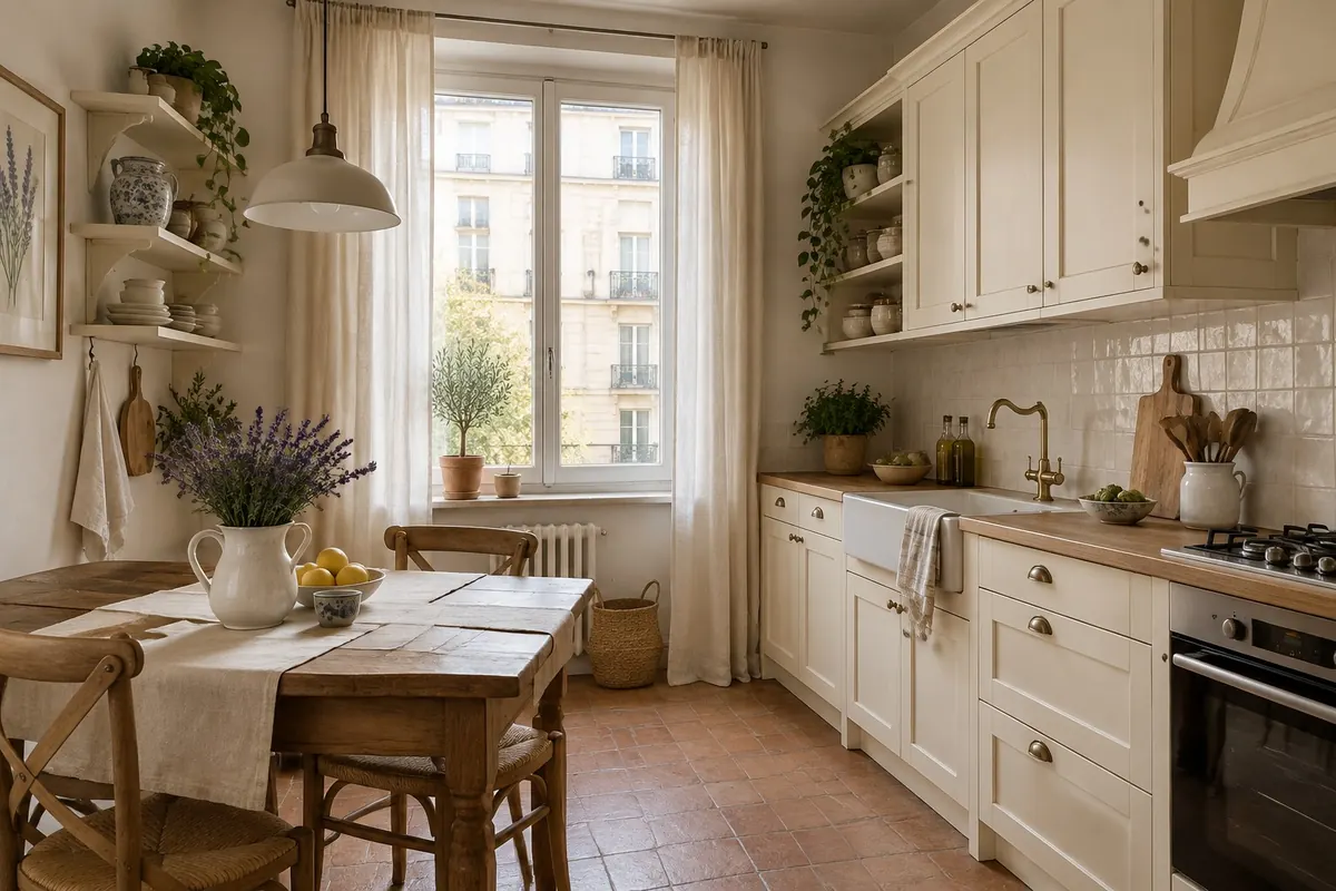
The kitchen is the easiest place to start with Provence. Three decisions are enough: light paneled cabinet fronts, a backsplash of small handmade tile or tile that looks handmade, and an open shelf with pottery. Appliances are better built in or chosen in white and cream. If the kitchen is small, start with the rules from the article on small kitchen design and add the style through fronts and textiles.
Provence bedroom
In the bedroom, Provence is easiest to build with textiles: linen bedding, a bedspread with a small print, a bed with a metal or wooden headboard, a nightstand with patina. No renovation needed.
Before you change your kitchen fronts or repaint the walls, see how a rural style sits in your room. There is no separate "Provence" style in Desow Redesign; the closest options in the list are English Country, Manor and Romantic. Try them on a photo of your room: the service keeps the layout and windows and shows the finishes and furniture in a new look. You can then add the Provence palette detail by detail.
How do you avoid a "grandma's house" look?
Provence turns into a grandma's apartment when there is more decor than empty space. Check the room against five rules:
- One pattern per room. If the curtains have a small floral, keep the upholstery and pillows plain or striped.
- Empty surfaces. No more than three objects on a dresser or a windowsill.
- Modern next to vintage. A simple sofa and ordinary appliances keep Provence urban and stop it from becoming a museum.
- Distressed in moderation. Wear on one or two pieces looks natural; on all the furniture at once it looks like a stage set.
- Light instead of knickknacks. A warm table lamp creates more atmosphere than five figurines.
There's an easy way to check yourself. Remove three decor items from the room and look at it again. If it got better, remove one more.
How do you check Provence on a photo of your room?
Provence depends heavily on light and room size. The same lavender wall looks soft in a south-facing room and cold and gray in a north-facing one. That's why it's better to decide based on your own room, not on someone else's photos of country houses.
- Photograph the room in daylight, at chest height, so that the window, the floor and at least two walls are visible.
- Make 2–3 versions in Redesign in English Country, Manor and Romantic. One version costs 10 credits. The free Free plan gives 40 credits once at sign-up, enough for four versions.
- Compare with a light style. A room often suits Scandinavian style with a couple of Provence details better than full Provence. Add a Scandinavian version for comparison.
- Add the Provence palette. Smart Edit changes the color of a wall or the material of a single object for 7 credits: whitewash the walls, repaint the cabinet fronts in cream, switch the curtain fabric to linen. Smart Edit works in a desktop browser.
- Write down the materials and colors from the best version: those are what you'll look for in stores.
An AI image shows the style and mood but does not measure furniture. How to check such a result before renovation, we covered in the article on AI for interior design.
Frequently asked questions
Does Provence work in a small apartment?
Yes, if you keep a light base and limit decor. Light walls and floors help a room feel more spacious, especially with good daylight. Heavy beams, a fireplace and thick curtains are better left to a country house.
Can you do Provence without renovating?
Partly. Textiles, lamps, pottery and one or two pieces with patina already give the style its character. Without repainting the walls and replacing glossy fronts, Provence will be incomplete but recognizable.
Does Provence go with modern appliances?
Yes. Appliances are better built into the furniture or chosen in white and cream. Chrome and black glossy appliances on display clash with the style.
How is Provence different from Mediterranean style?
Mediterranean style has a stricter palette: white with saturated blue or turquoise, fewer floral prints and less patina. Provence is softer, with more pastels, lavender and vintage furniture.
What kind of stretch ceiling suits Provence?
If you can't do without a stretch ceiling, choose matte white, with no gloss and no multi-level structures. Then it looks like an ordinary whitewashed ceiling.
In short
- Provence is a whitewashed base, light wood with patina, linen and cotton, and no more than two pastel accents per room.
- Moderation sets it apart from shabby chic; light furniture and pastels instead of earthy tones set it apart from country.
- In an apartment, the style rests on finishes, furniture and textiles: beams and a fireplace are optional.
- The main mistake is clutter: one pattern per room and no more than three objects on a surface.
- Before you buy anything, try the closest styles on a photo of your room - English Country, Manor, Romantic - and fine-tune the palette with Smart Edit.