Interior color combinations: a chart of pairs, the 60-30-10 rule and testing color on a photo of your room
Interior color combinations: a chart of proven pairs, the 60-30-10 rule, how light and window direction change color, and testing wall paint on your photo.
A good interior color combination rests on three roles: a calm main color on the walls, a second color in large furniture and textiles, and a third in small accents. You pick the pairs with the color wheel and test them in two stages: first on a photo of your own room, then with a sample patch on the wall.
The internet is full of color combination charts, and almost all of them answer the question "what looks good with what." A real room asks something else: how will this color look in my place, with my floor, my window and my sofa. Below you will find a chart of pairs, a simple proportion scheme and a testing routine that keeps the paint on your wall from becoming a surprise.
How does the 60-30-10 rule work?
The 60-30-10 rule splits a room into three shares: the main color takes about 60% of the space, the secondary color 30%, and the accent 10%. That is how Skillbox Media puts it, for example. It's a guide to proportions, not an exact measure of area.
In an apartment the shares usually fall like this:
- 60% is the background. Walls, sometimes together with the ceiling and large built-in cabinets. Calm colors work here: white, gray, beige, light olive.
- 30% is furniture and textiles. The sofa, curtains, rug, kitchen fronts. This color sets the character of the room.
- 10% is accents. Pillows, art, vases, lamps. They are the easiest things to swap, so a bold color is safest to start here.
You do not need a ruler to measure the shares. The rule is useful as a check: if three colors compete for attention equally in a picture of the room, one of them should move into the background or become an accent.
Which colors go together: a chart of pairs
The chart below is a starting point. It lists common combinations, but on your wall a pair may still look different: that depends on the light and on what is already in the room.
| Main color | Pair it with | Where it works | Watch out |
|---|---|---|---|
| Warm white | wood, linen, graphite, olive | any room, small spaces | cool white in a north-facing room looks gray |
| Light gray | white, wood, dusty pink, mustard | living room, bedroom, home office | gray on gray without wood and textiles feels like an office |
| Beige, sand | brown, terracotta, olive, navy | living room, bedroom, entryway | beige under yellowish bulbs can turn yellow |
| Graphite | warm white, brass, light wood, ochre | accent wall, kitchen, home office | on every wall of a small room it feels heavy |
| Olive, sage | milky white, wood, terracotta, cream | kitchen, bedroom, living room | next to cool gray it looks dull |
| Navy | white, sand, mustard, brass | bedroom, home office, accent wall | a room with one window needs good lamp light |
| Terracotta | milky white, olive, sand, brown | living room, kitchen, a kids' room in a muted tone | clashes with bright red |
| Ochre, mustard | brown, navy, graphite, cream | accents, textiles, one wall | tiring on a large area |
| Dusty pink | gray, milky white, olive, brass | bedroom, kids' room, bathroom | with cool white it looks doll-like |
| Chocolate brown | cream, beige, turquoise, gold | living room, home office, bedroom | needs a light floor or light walls nearby |
Many rows pair a color with a material: wood, linen, brass. Texture works like a neutral color: it ties together pairs that would look random without it.
What schemes the color wheel suggests
The color wheel explains why some pairs feel calm and others feel loud. Four schemes are enough for an apartment.
Monochromatic
One color in several shades: light gray walls, a gray sofa, graphite armchairs. This is the safest scheme, but it needs varied texture, such as linen, wool and wood, or the room looks flat.
Analogous
Neighboring colors on the wheel: ochre, terracotta and brown, or blue, teal and green. There are no sharp transitions in this scheme, so the look is unified: warm in the first set, cool in the second. It suits living rooms and bedrooms well.
Complementary
Opposite colors: blue and orange, green and red. In interiors they are toned down: navy with ochre, olive with terracotta. The bright version is kept for accents, or the colors start to fight.
Triadic
Three colors evenly spaced around the wheel. This is the hardest scheme: one color becomes the main one, and the other two appear in small shares, following 60-30-10.
One room, three palettes
Color combinations are easier to understand when you see the same room in different palettes. Below is one living room in three versions: the furniture itself changes, but it stays in the same places.
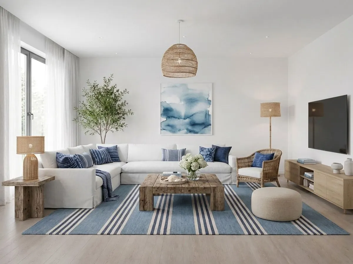
The first version is light and follows 60-30-10 almost to the letter. White walls and a white sofa form the background, light wood in the tables and media console is the second color, and blue in the pillows, rug and art is the accent. The room looks fresh and airy.
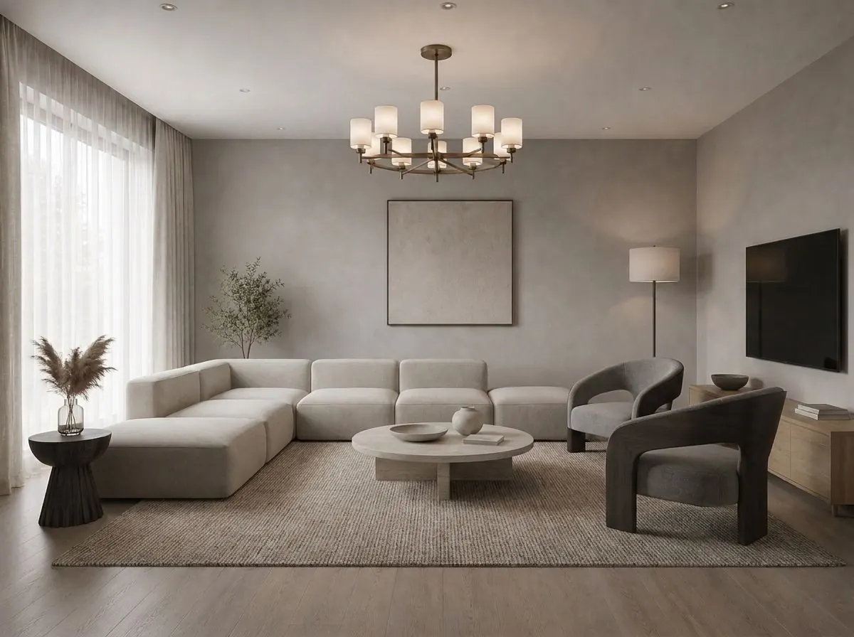
The second version is monochromatic: gray-beige walls, a light sofa, graphite armchairs, wood in the media console. There are no bright accents, and the room looks stricter and quieter than the white and blue one.
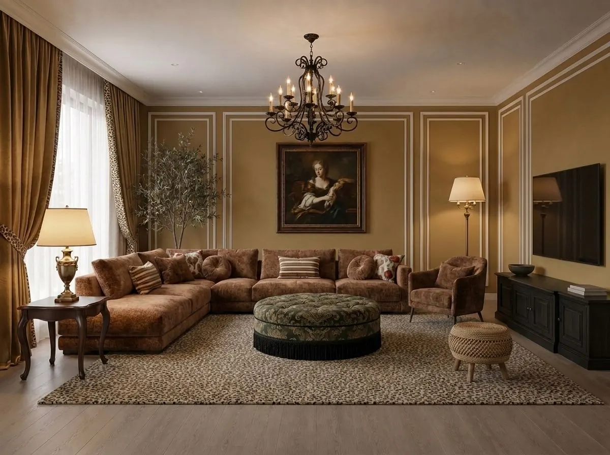
The third version is a warm analogous scheme: ochre walls, brown velvet, dark wood, a patterned green ottoman as the accent. The space feels smaller and cozier, and in the evening the lamps set the mood.
The furniture differs in all three versions, but what sets the rooms apart first is color. That is why choosing a color from someone else's photos is risky: they have different light and a different floor area. If you want to compare palettes on your own room, upload a photo to Desow Smart Edit, select the wall and describe the new color: the rest of the room stays as it is.
How do light and window direction change wall color?
The same shade on a sunny wall and on a north-facing wall looks like two different colors. That is why wall color is chosen with the light in mind, not from a fan deck in the store.
What LRV is
LRV, light reflectance value, shows what percentage of visible light a painted surface reflects. It ranges from 0% for absolute black to 100% for absolute white (ES Media). Manufacturers often print LRV on the color card. For a dark room it makes sense to look for paint with a high value: it returns more light to the space.
Window direction
- North. The light is even and cool. Cool grays and blues turn grayish here, while shades with a warm undertone, such as beige, warm white and olive, hold their color better.
- South. The light is warm and bright. Cool and muted colors work well, while saturated warm colors can look like they glow.
- East and west. The color shifts during the day: the same wall looks different in the morning and in the evening, so check your sample at both times.
These are starting points. Wall color also depends on the trees and buildings outside the window and on the color of the floor and the neighboring walls.
Lamps change color too. Warm light makes beige look more yellow, cool light makes gray look bluer. Check the sample under the lighting the room will actually have.
How to choose a wall color: five steps
This routine lowers the risk of repainting: each step rules out some options before you even buy paint.
- Write down what will not change. The floor, kitchen fronts, sofa, doors. These colors already set the palette, and the new wall color has to work with them.
- Pick a scheme and three colors. Take a row from the chart above and decide which color goes to 60%, which to 30% and which to 10%.
- Test on a photo of your room. Take a daytime photo and compare 2–3 wall colors on the same shot. In Desow this is what Smart Edit does: one edit costs 7 credits, and the 40 credits on the Free plan cover five comparisons. Smart Edit works in a desktop browser; it is not available on phones yet.
- Paint a sample patch. Buy samples of the two finalists and apply each to the wall in two coats, in a patch at least 50×50 cm (about 20×20 in). That size is recommended, for example, by Finntella. Look at it once it is fully dry: in the morning, during the day and in the evening under lamps.
- Account for the light. If the sample looks muddy in the shade, pick a lighter shade or one with a warm undertone.
The photo and the sample patch do different jobs. The picture shows how colors work together and how the mood of the room changes. It cannot convey the exact shade: screens and neural networks distort color, so the final decision is made with a sample on the wall. We covered how to choose the style itself before painting in the article on choosing a style before renovation.
Frequently asked questions
How many colors can you use in one room?
Three colors in the 60-30-10 roles plus neutral materials, such as wood, linen and metal, are usually enough. If there are more colors, one of them should clearly lead, or the room looks busy.
What wall color works for a small room?
A light color with a high light reflectance value (LRV), matched to the ceiling. A dark color can work in a small room too, but on one wall and with good lamp light.
Can you combine warm and cool colors?
Yes, if one of them leads. For example, warm beige walls and a navy sofa work because the navy takes the secondary share instead of competing with the walls as an equal.
How do you test a wall color before painting?
In two steps. First compare the options on a photo of your room, for example in Smart Edit. Then paint samples of the finalists on the wall in patches at least 50×50 cm and look at them at different times of day.
Which colors are in fashion in 2026?
Pantone named the neutral white Cloud Dancer its Color of the Year 2026 (RBC), and interiors show growing interest in warm neutral shades. The other directions of the year are collected in the article on 2026 interior trends.
In short
- Interior color combinations are built by roles: 60% background, 30% furniture and textiles, 10% accents.
- A chart of pairs is a start, not a decision: on your wall the color depends on the light and on what is already in the room.
- North-facing rooms suit shades with a warm undertone and high LRV; south-facing rooms suit cool and muted shades.
- First compare 2–3 colors on a photo of your room in Smart Edit, then check the finalists with a sample patch.
- A palette changes how a room feels a great deal, so settle it before you buy paint and furniture.